

Appearance

Fields
Add a field by selecting its type under Fields in the builder; see The form builder.
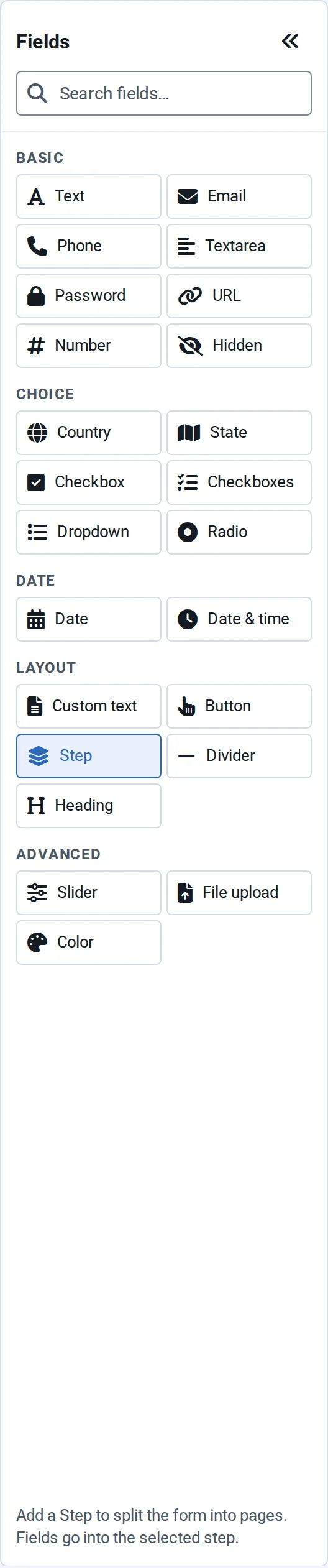
Field types
| Group | Field | Use it for |
|---|---|---|
| Basic | Text | A short answer, such as a name |
| An email address, checked for a valid format | ||
| Phone | A phone number | |
| Textarea | A longer answer, such as a message | |
| Password | A secret the visitor types; it's never stored in saved drafts | |
| URL | A web address, checked for a valid format | |
| Number | A number, with an optional minimum, maximum and step | |
| Hidden | A value the visitor doesn't see, for example from a link (see Prefill from links) | |
| Choice | Country | A country, from a list named in the visitor's language |
| State | A state or region for the chosen country; a text box where the country has no list | |
| Checkbox | One yes/no choice, such as agreeing to terms | |
| Checkboxes | Several choices from a list | |
| Dropdown | One choice from a list | |
| Radio | One choice, with every option visible | |
| Date | Date | A date |
| Date & time | A date with a time | |
| Layout | Custom text | A paragraph of text between fields |
| Button | A submit or other button, in the Form buttons area | |
| Step | Starts a new step: see Multi-step forms | |
| Divider | A line between groups of fields | |
| Heading | A heading above a group of fields | |
| Advanced | Slider | A number picked on a slider |
| File upload | One file; uploads stay private (see File uploads and privacy) | |
| Color | A colour picked with the browser's colour picker |
More field types are listed under Advanced fields.
Field settings
Select a field to see its settings beside the canvas. They're grouped into sections; a section a field type doesn't need, such as Validation on a divider, isn't shown.
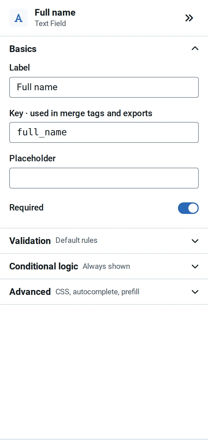
- Basics: the label, the key, the placeholder or the list of options, and Required.
- Validation: checks on the answer and the error message: see Validation.
- Conditional logic: when the field is shown: see Conditional logic.
- Advanced: CSS classes, the autocomplete purpose, custom attributes, and Prefill from URL.
Field keys
Each field has a key, used in email merge tags, exports and integrations. A new field's key is built from its label, for example job_title for "Job title", and follows the label until you save the form or change the key yourself. A second field of the same type is numbered, such as password_2.
Once a form is saved, its keys stay fixed. You can still type a different key in Full mode, but past entries and exports keep the old one, and the builder warns you.
Required fields
Required marks a field with a red asterisk, and forms with required fields say "Fields marked * are required." above the fields. The browser checks required fields, and email and URL formats, before sending, and NXForms checks them again on the server.
Autocomplete
Autocomplete purpose tells browsers and password managers what a field holds, such as a name or an email address, so visitors can fill it in quickly. Auto (detect from field name) works for most fields.